
How many women in New York are pregnant right now?
When I found out that J was pregnant, my first thought was OMG, I’m so excited to be a dad! My second thought was, I wonder how many other women in New York are also pregnant right now? Knowing that there was plenty of health and demographic public data available, I was pretty sure I could answer this question.
After a little googling, I found this brief from the Centers for Disease Control and Prevention (CDC) which details how to estimate the number of pregnant women in a geographic area. Bingo!
To calculate the number of pregnant women in a given area, you need to specify four parameters:
- Number of women of reproductive age [WRA] (15 – 44 years old)
- Fertility rate (live births per 1,000 WRA)
- Abortion rate (induced abortions per 1,000 WRA)
- Fetal loss rate (fetal deaths per 1,000 WRA)
With these parameters, there is a very simple calculation to arrive at the total number of women who are pregnant. Given the following variables:
\[ \begin{aligned} wra ={} & \text{women of reproductive age}\\ b ={} & \text{fertility rate (births)}\\ a ={} & \text{abortion rate} \\ d ={} & \text{fetal loss rate (deaths)} \\ P ={} & \text{proportion of the year a woman} \\ & \text{is pregnant for each outcome} \\ & P_b\colon \text{ 9 months} = .75 \\ & P_a\colon \text{ 2 months} = .167 \\ & P_d\colon \text{ 3 months} = .25 \end{aligned} \]
The expression to estimate the number of women who live in a given geographical area that are currently pregnant is:
\[ \begin{aligned} wra/1000 \times ((b \times P_b) + (a \times P_a) + (d \times P_d)) \end{aligned} \]
Following the CDC guidance, I determined the best and most recent sources of data for each of these parameters for New York State:
- NYS Department of Health Vital Statistics, 2015, Table 1a
- NYS Department of Health Vital Statistics, 2015, Table 7
- NYS Department of Health Vital Statistics, 2015, Table 21
- CDC National Vital Statistics Reports, Estimated Pregnancy Rates and Rates of Pregnancy Outcomes for the United States, 2012, Table 1
The NYS Department of Health reports this data at the county level, so I will calculate results for each of New York’s 62 counties.1 I will also use demographic data from the American Community Survey to contextualize the results.
Let’s get to it!
The first step is to scrape and clean the vital statistics data from the NYS Department of Health website.
# load all the packages i'll need
library(tidyverse)
library(rvest)
library(sf)
library(tidycensus)
library(tmap)

# nys health data lives here
health_web <- "https://www.health.ny.gov/statistics/vital_statistics/2015/"

# each parameter lives in a table on a different page
pop <- read_html(paste0(health_web, "table01a.htm"))
birth <- read_html(paste0(health_web, "table07.htm"))
abort <- read_html(paste0(health_web, "table21.htm"))
# define a function to find and parse the table node,
# select the columns i need, and make it into a tibble
# thankfully, the table formatting is the same on each page
read_nys_xml_table <- function(x) {
html_nodes(x, "table") %>%
html_table(fill = TRUE) %>%
as.data.frame() %>% # i'm not sure why i can't coerce directly to tibble
as_tibble() %>%
slice(-(c(1:5, 11:12)))
}
# parse and clean population
population <- read_nys_xml_table(pop) %>%
transmute(
county = County,
pop_wra = as.integer(str_replace(Var.2, ",", ""))
) %>%
# combine essex/hamilton counties
add_row(
county = "Essex/Hamilton",
pop_wra = sum(.$pop_wra[.$county %in% c("Essex", "Hamilton")])
) %>%
filter(!county %in% c("Essex", "Hamilton"))
# parse and clean live births
live_births <- read_nys_xml_table(birth) %>%
transmute(
county = County,
live_births = as.integer(str_replace(Var.2, ",", ""))
) %>%
# combine essex/hamilton counties
add_row(
county = "Essex/Hamilton",
live_births = sum(.$live_births[.$county %in% c("Essex", "Hamilton")])
) %>%
filter(!county %in% c("Essex", "Hamilton"))
# parse and clean abortions
abortions <- read_nys_xml_table(abort) %>%
transmute(
county = County,
abortions = as.integer(str_replace(Var.2, ",", ""))
) %>%
# essex/hamilton is already aggregated here, but repeated as hamilton/essex
filter(county != "Hamilton/Essex")
# let's print one tibble to make sure it looks right
live_births## # A tibble: 61 x 2
## county live_births
## <chr> <int>
## 1 Bronx 21130
## 2 Kings 41514
## 3 New York 17775
## 4 Queens 30335
## 5 Richmond 5286
## 6 Albany 3161
## 7 Allegany 496
## 8 Broome 1972
## 9 Cattaraugus 880
## 10 Cayuga 716
## # ... with 51 more rowsNow that I’ve got all the Department of Health data cleaned up, I’ll join the raw numbers for population, births and abortions into one tibble and calculate rates per 1,000 women of reproductive age for births and abortions. I’m also adding the national fetal loss rate of 17.9 per 1,000 women of reproductive age to each county.2 After I join all the parameters, I can calculate the pregnancy rate using the expression specified above.
# join scraped data, calculate rates and total pregnant women
preg_rate <- reduce(list(population, live_births, abortions), left_join) %>%
  mutate(
    fertility_rate = (live_births / pop_wra) * 1000,
    abortion_rate = (abortions / pop_wra) * 1000,
    fetal_loss_rate = 17.9, # national rate per cdc
    preg_tot = as.integer((pop_wra / 1000) *
      (
        (fertility_rate * 0.75)
        + (abortion_rate * 0.167)
          + (fetal_loss_rate * 0.25)
      ))
  ) %>%
  # rename to join with census data later
  mutate(county = recode(county, "St Lawrence" = "St. Lawrence"))
preg_rate
## # A tibble: 61 x 8
## county pop_wra live_births abortions fertility_rate abortion_rate
## <chr> <int> <int> <int> <dbl> <dbl>
## 1 Bronx 326993 21130 14992 64.6 45.8
## 2 Kings 606681 41514 18026 68.4 29.7
## 3 New York 418799 17775 10294 42.4 24.6
## 4 Queens 496216 30335 13681 61.1 27.6
## 5 Richmond 92426 5286 1634 57.2 17.7
## 6 Albany 66574 3161 1139 47.5 17.1
## 7 Allegany 9001 496 36 55.1 4.00
## 8 Broome 37951 1972 690 52.0 18.2
## 9 Cattaraugus 13631 880 79 64.6 5.80
## 10 Cayuga 13223 716 139 54.1 10.5
## # ... with 51 more rows, and 2 more variables: fetal_loss_rate <dbl>,
## # preg_tot <int>Next up we’ll download county-level demographic data from the American Community Survey (ACS) using the wonderful tidycensus package. This package gives you easy access to Census API and as a bonus has the option to download TIGER/Line or cartographic boundary shapefiles and convert them to sf objects containing population estimates. With the addition of the county geometry data, I can do some mapping to see if pregnancy rate appears to be related to geography.
If you haven’t used tidycensus before, the first step after installing the package is to set a Census API key. A key can be requested here: https://api.census.gov/data/key_signup.html. To install the key in your .Renviron file simply run the following:
tidycensus::census_api_key("YOUR API KEY GOES HERE")For now, I’m just going to download the total population and total female population of each county. (In a later blog post, I’ll do some additional analysis using more sociodemographic variables to model the pregnancy rates.)
# cache downloaded shapefiles so don't have to re-download each time
options(tigris_use_cache = TRUE)

# download acs 5 year estimates
acs_pop <- get_acs(
  state = "NY",
  geography = "county",
  variables = "B01001_026", # female pop
  survey = "acs5",
  summary_var = "B01001_001", # total pop
  year = 2016,
  geometry = TRUE
)

# clean up county names for joining and rename vars
fem_pop <- acs_pop %>%
  mutate(county = str_replace(NAME, "\\ County.*", "")) %>%
  select(county, pop_tot = summary_est, pop_fem = estimate)

# calculate combined populations for essex and hamilton counties
esx_ham <- fem_pop %>%
  filter(county %in% c("Essex", "Hamilton")) %>%
  summarise(
    county = "Essex/Hamilton",
    pop_tot = sum(pop_tot),
    pop_fem = sum(pop_fem)
  ) %>%
  st_cast("MULTIPOLYGON")
Now I’ll join the Census variables and geographies with the rates I calculated from the NYS Department of Health to create one final data frame with everything I need to summarize and map the results.
# add essex/hamilton row and join with dept of health rates
# calc pregnant women as a proportion of female pop, total pop, and wra pop
preg_sf <- rbind(fem_pop, esx_ham) %>%
  filter(!county %in% c("Essex", "Hamilton")) %>%
  left_join(preg_rate) %>%
  mutate(
    preg_fem_prop = preg_tot / pop_fem,
    preg_wra_prop = preg_tot / pop_wra,
    preg_tot_prop = preg_tot / pop_tot
  ) %>%
  st_transform(2261)
If you’ve never worked with an sf object before, it is essentially a tibble with an additional column specifying the coordinates of the geometry associated with each row. So in this case, each row is a county and the geometry column is a list-column of XY coordinates that specify the shape of each county polygon.
An sf object prints like a tibble, but it includes some additional information relating to the geometry at the top.
# select first 4 cols for pretty printing here
preg_sf %>% select(1:4)
## Simple feature collection with 61 features and 4 fields
## geometry type: GEOMETRY
## dimension: XY
## bbox: xmin: -79.76215 ymin: 40.4961 xmax: -71.85621 ymax: 45.01585
## epsg (SRID): 4269
## proj4string: +proj=longlat +datum=NAD83 +no_defs
## First 10 features:
## county pop_tot pop_fem pop_wra geometry
## 1 Delaware 46480 23124 7341 MULTIPOLYGON (((-75.42264 4...
## 2 Jefferson 117966 56212 22780 MULTIPOLYGON (((-76.14753 4...
## 3 Livingston 64622 32183 12556 MULTIPOLYGON (((-78.06075 4...
## 4 Madison 72089 36660 13837 MULTIPOLYGON (((-75.99243 4...
## 5 Nassau 1356801 698640 248449 MULTIPOLYGON (((-73.49097 4...
## 6 Oneida 232858 116831 41260 MULTIPOLYGON (((-75.88676 4...
## 7 Oswego 120513 60129 22725 MULTIPOLYGON (((-76.61693 4...
## 8 Otsego 60979 31462 12291 MULTIPOLYGON (((-75.41693 4...
## 9 Suffolk 1498130 760779 275010 MULTIPOLYGON (((-72.03683 4...
## 10 Cattaraugus 78506 39711 13631 MULTIPOLYGON (((-79.05921 4...I’ve got the data cleaned up and I’ve calculated all the rates and proportions we need, so now I can do some exploring and mapping. First, I’ll look at raw numbers of pregnant women since my initial question was, how many women in New York are pregnant?
# create non-sf object to work with
preg <- preg_sf %>%
  st_set_geometry(NULL) %>%
  as_data_frame()

# totals for whole state
preg %>% summarize(
  total_preg = sum(preg_tot),
  total_wra = sum(pop_wra),
  total_fem = sum(pop_fem),
  total_pop = sum(pop_tot)
)
## # A tibble: 1 x 4
## total_preg total_wra total_fem total_pop
## <int> <int> <dbl> <dbl>
## 1 209474 4036145 10142327 19697457There are aproximately 209,474 pregnant women in New York State right now. This is 5.2% of all women of reproductive age (15 - 44) living in New York.
But since I have this data at the county level, I can take a look at differences between counties. I know that more populous places will have more pregnant women, but is the proportion of pregnant women consistent across the state?
To explore that question, I can make a chart showing the percentage of women of reproductive age who are pregnant in each county.
ggplot(preg, aes(x = reorder(county, preg_wra_prop), y = preg_wra_prop)) +
  geom_col(color = "royalblue", width = 0.08) +
  geom_point(color = "royalblue", size = 1.5) +
  labs(
    title = paste0(
      "Percentage of women of reproductive age (15 – 44)\n",
      "who are pregnant in New York State by county"
    ),
    y = "Percent pregnant",
    x = "",
    caption = paste(
      "Source: NYS Department of Health Vital Statistics,",
      "2015, Tables 1a, 7, and 21\nCDC National Vital",
      "Statistics, Pregnancy Outcomes for the US,",
      "2008, Table 1\nUS Census Bureau, American Community",
      "Survey, 2012 - 2016, Table B01001"
    )
  ) +
  theme_bw() +
  theme(
    axis.text.x = element_text(size = 7, angle = 60, vjust = 0.5),
    axis.title.y = element_blank(),
    plot.caption = element_text(size = 7, face = "italic"),
    panel.grid.major.x = element_blank()
  ) +
  scale_y_continuous(labels = scales::percent)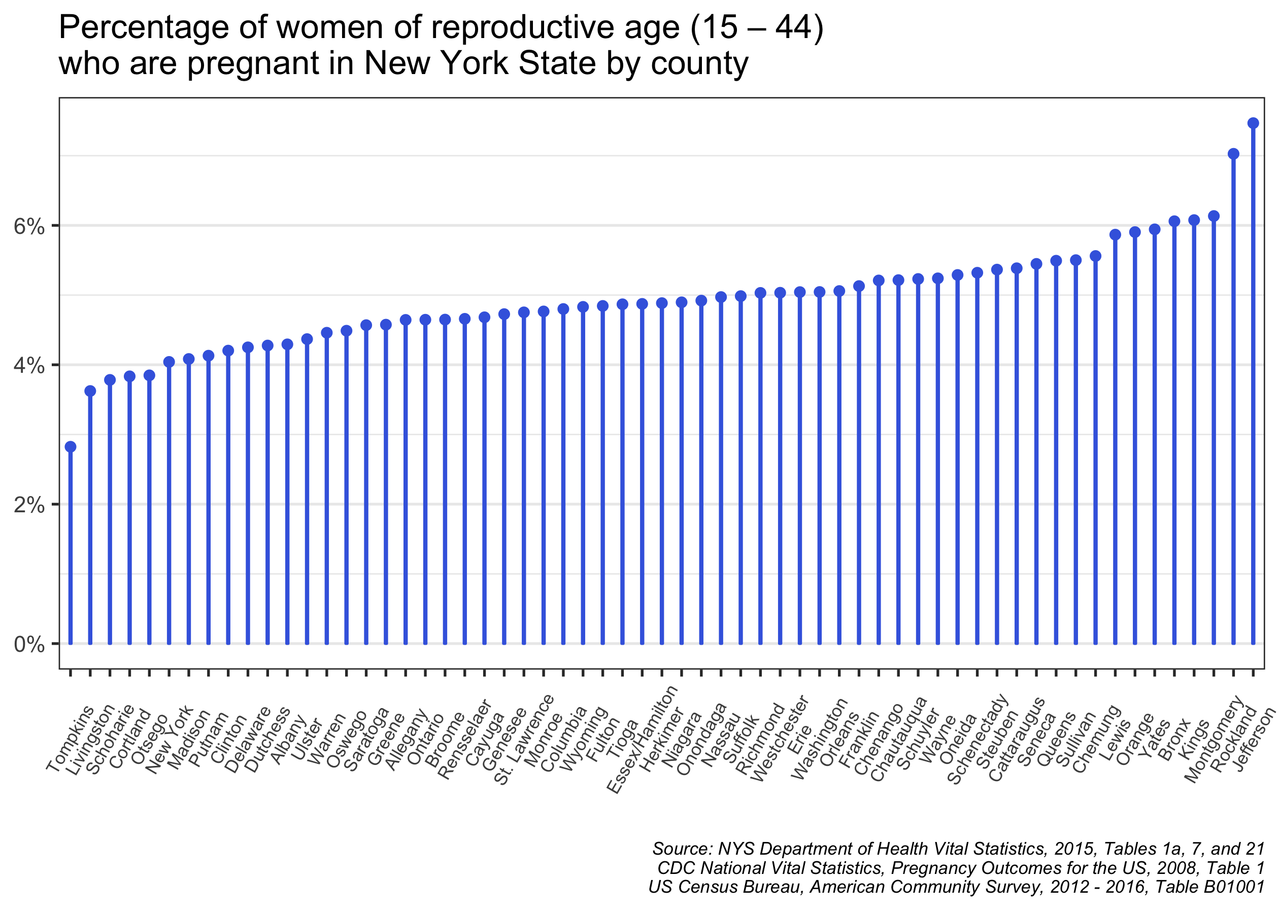
It looks like the percentage in most counties is between 4% and 6%, but there are some outliers, especially at the high end. In Jefferson County, 7.5% of women of reproductive age are estimated to be pregnant, well above the statewide average of 5.2%. Other counties with above-average pregnancy percentages are Rockland, Montgomery, Kings (Brooklyn), and Bronx counties.
On the low end of the distribution is Tompkins County, where only 2.8% of women of reproductive age are pregnant. Cornell University and Ithaca College are located in Tompkins County, so it seems that the college students are inflating the number of women between 15 and 44 and thus driving down the pregnancy rate. (In a later blog post, I’ll explore covariates that are associated with county-level pregnancy rates and begin to explain these observed differences.)
Finally, I’d like to put these results on a map. This is relatively straightforward since I already downloaded county geometries along with my Census data. But, I had some trouble figuring out how to best represent total pregnancies as well as pregnancy rates. I landed on two maps for these two phenomena.
First, to show the raw numbers of pregnant women, I’ll make a dot-density map where each dot represents 50 pregnant women. This is achieved quite easily in the sf package by using st_sample(), which randomly creates a given number of points within a polygon. Then using the tmap package, I plot these dots on top of New York county polygons.
# randomly sample dots - 1 per 50 pregnant women by county
dots <- preg_sf %>%
  st_sample(size = .$preg_tot / 50)

# make a map of dots and county polygons
  tm_shape(preg_sf) +
    tm_borders(col = "darkgray") +
    tm_shape(dots) +
    tm_dots(col = "royalblue", size = 0.015) +
    tm_add_legend(
      type = "symbol",
      labels = " 1 dot = 50 pregnant women",
      size = 0.05,
      shape = 19,
      col = "royalblue"
    ) +
    tm_layout(
      main.title = "Dot-density map of pregnant women\nin New York State, 2015",
      main.title.size = 1.2,
      frame = FALSE,
      legend.position = c(0.01, 0.17),
      legend.text.size = 1
    ) +
    tm_credits(
      text = paste(
        "Source: NYS Department of Health Vital Statistics,",
        "2015, Tables 1a, 7, and 21\nCDC National Vital",
        "Statistics, Pregnancy Outcomes for the US,",
        "2008, Table 1\nUS Census Bureau, American Community",
        "Survey, 2012 - 2016, Table B01001"
      ),
      size = 0.5,
      fontface = "italic",
      align = "left",
      position = c(0.01, 0.02)
    )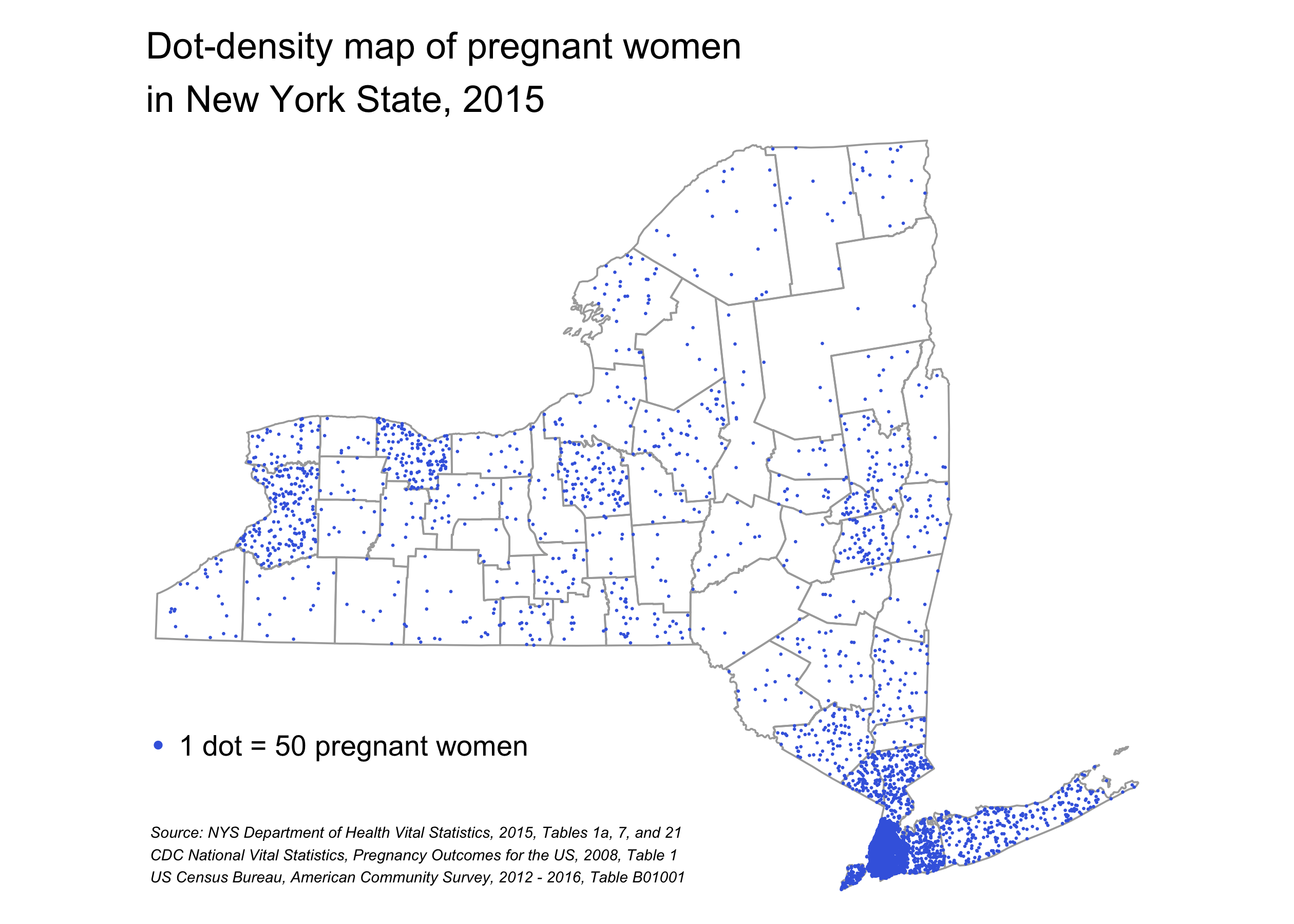
This map does a decent job of representing where pregnant women live in New York, but it more or less looks like a map of total population density in New York State. To show the variation observed in pregnancy rates, I need to make a map with these relative percentages, rather than total numbers of pregnant women. To do this, I turn to a choropleth map where the colors of the counties represent the percentage of women of reproductive age who are pregnant. And to spice it up, I’ll make this map interactive and add a basemap and popups with detailed data for each county.
# change tmap to interactive mode
tmap_mode("view")

# define a little helper function to format percentages
make_pct <- function(x, digits = 1) {
  paste0(formatC(x * 100, digits = digits, format = "f"), "%")
}

# make that map
tm_shape(preg_sf) +
  tm_fill(
    col = "preg_wra_prop", # define fill variable
    palette = "GnBu", # pick a pretty color palette
    contrast = c(0.2, 0.8), # modify starting and ending contrast of colors
    n = 5, # choose 5 bins
    style = "jenks", # use natural breaks to pick bins
    title = "Pregnancy Rate",
    legend.format = list(fun = make_pct),
    popup.vars = c(
      "Pregnant Women" = "preg_tot",
      "Percent Pregnant of WRA" = "preg_wra_prop",
      "Total Female Population" = "pop_fem",
      "Women of Reproductive Age (WRA)" = "pop_wra",
      "Total Population" = "pop_tot",
      "Abortion Rate (per 1,000 WRA)" = "abortion_rate",
      "Birth Rate (per 1,000 WRA)" = "fertility_rate",
      "Fetal Loss Rate (per 1,000 WRA)" = "fetal_loss_rate"
    ),
    id = "county",
    popup.format = list(
      preg_tot = list(format = "f"),
      preg_wra_prop = list(fun = make_pct),
      pop_fem = list(format = "f"),
      pop_wra = list(format = "f"),
      pop_tot = list(format = "f"),
      abortion_rate = list(format = "f", digits = 1),
      fertility_rate = list(format = "f", digits = 1),
      fetal_loss_rate = list(format = "f", digits = 1)
    )
  ) +
  tm_borders(col = "darkgray")
I’m not thrilled with this map, partly because the binning of the pregnancy rate is somewhat arbitrary. (I also can’t figure out why knitr/blogdown/hugo is stripping the nice formatting from the popups!) But with this map, we generally know which counties have relatively high percentages of pregnant women. It also appears that there is not a terribly strong relationship between geography and pregnancy rate. In other words, the counties with high pregnancy rates are relatively spread out in the state rather than tightly clustered. This suggests that are other, non-spatial factors that are associated with the pregnancy rate.
Wow, that was longer than I thought! But I hope you found it interesting/useful. Look out for more posts in the future exploring the covariates of pregnancy rates (as well as on other topics!). Also, I very much welcome any suggestions for how to improve the code or visualizations above.
Due to the small number of abortions in Essex and Hamilton Counties, the NYS Department of Health reports combined numbers for these counties to protect privacy. Therefore, I aggregate all rates and calculations for these two counties.↩
The CDC recommend that that national fetal loss rate be used as the rate does not vary systematically by geography and the CDC national estimate is likely more accurate than state Departments of Health estimates.↩


