
space = "free" or how to fix your facet (width)
No one loves a ggplot facet more than me, so recently when I was making a bar chart at work comparing the performance of different offices, I thought I would throw in a facet_wrap() to separate the offices by region. This would help to visually compare the performance between offices within each region, as well as showing system-wide performance. But what I soon realized is that my regions had different numbers of offices and so the widths of the bars were different across facets. Ugly! And also misleading because the width of the bars didn’t have any real meaning.
Enter, space = "free".
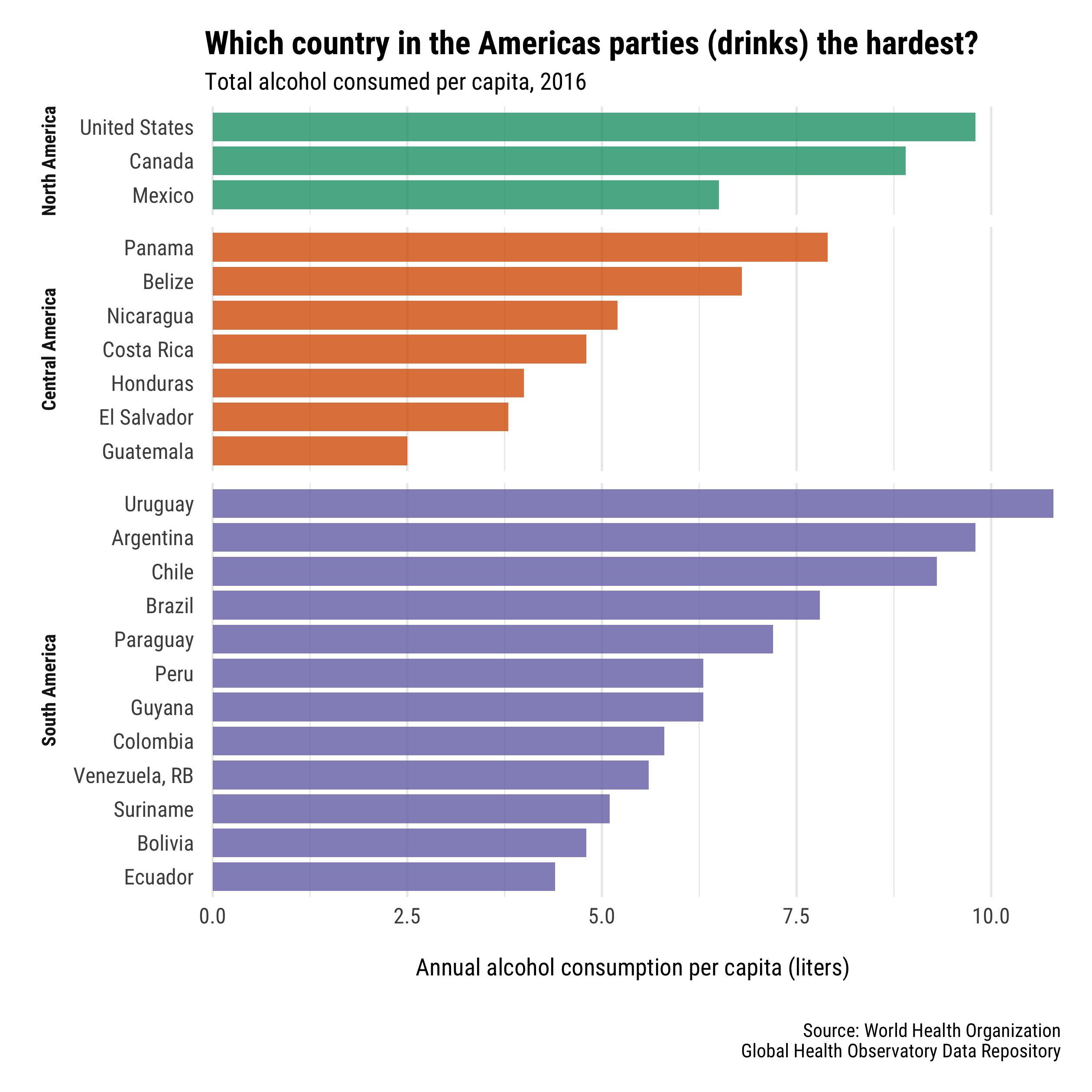
Since I can’t use work data, I’ll answer a fun question: which country in the Americas consumes the most alcohol per capita? I have 22 countries in three regions (North, Central, and South America). There are three countries in North America, seven counties in Central America, and 12 counties in South America (where this data is available).
First, I’ll use {wbsats} to download alcohol consumption data from the World Bank API. The indicator is named SH.ALC.PCAP.LI, and I’ll grab it for the most recent year available.
library(tidyverse)
library(wbstats)
library(scales)

# define regions in the americas
americas <- tribble(
  ~iso3c, ~region,
  "CAN", "North America",
  "USA", "North America",
  "MEX", "North America",
  "GTM", "Central America",
  "BLZ", "Central America",
  "SLV", "Central America",
  "HND", "Central America",
  "NIC", "Central America",
  "CRI", "Central America",
  "PAN", "Central America",
  "COL", "South America",
  "VEN", "South America",
  "GUY", "South America",
  "SUR", "South America",
  "ECU", "South America",
  "BRA", "South America",
  "PER", "South America",
  "BOL", "South America",
  "PRY", "South America",
  "URY", "South America",
  "ARG", "South America",
  "CHL", "South America"
  )

# get alcohol data from wold bank
alcohol_per_cap <- wb(
  country = americas$iso3c,
  indicator = "SH.ALC.PCAP.LI",
  mrv = 1
  ) %>%
  left_join(americas, by = "iso3c") %>%
  select(country, value, region) %>%
  arrange(desc(value)) %>%
  as_tibble()

head(alcohol_per_cap)
## # A tibble: 6 x 3
##   country       value region
##   <chr>         <dbl> <chr>
## 1 Uruguay        10.8 South America
## 2 Argentina       9.8 South America
## 3 United States   9.8 North America
## 4 Chile           9.3 South America
## 5 Canada          8.9 North America
## 6 Panama          7.9 Central America
Alright, the countries that drink the most are Uruguay, Argentina, and the United States!
So let’s make a bar plot that shows each country’s alcohol consumption, faceted by region:
alcohol_per_cap %>%
  ggplot(aes(x = country, y = value)) +
  geom_col() +
  facet_wrap(vars(region), scales = "free_x")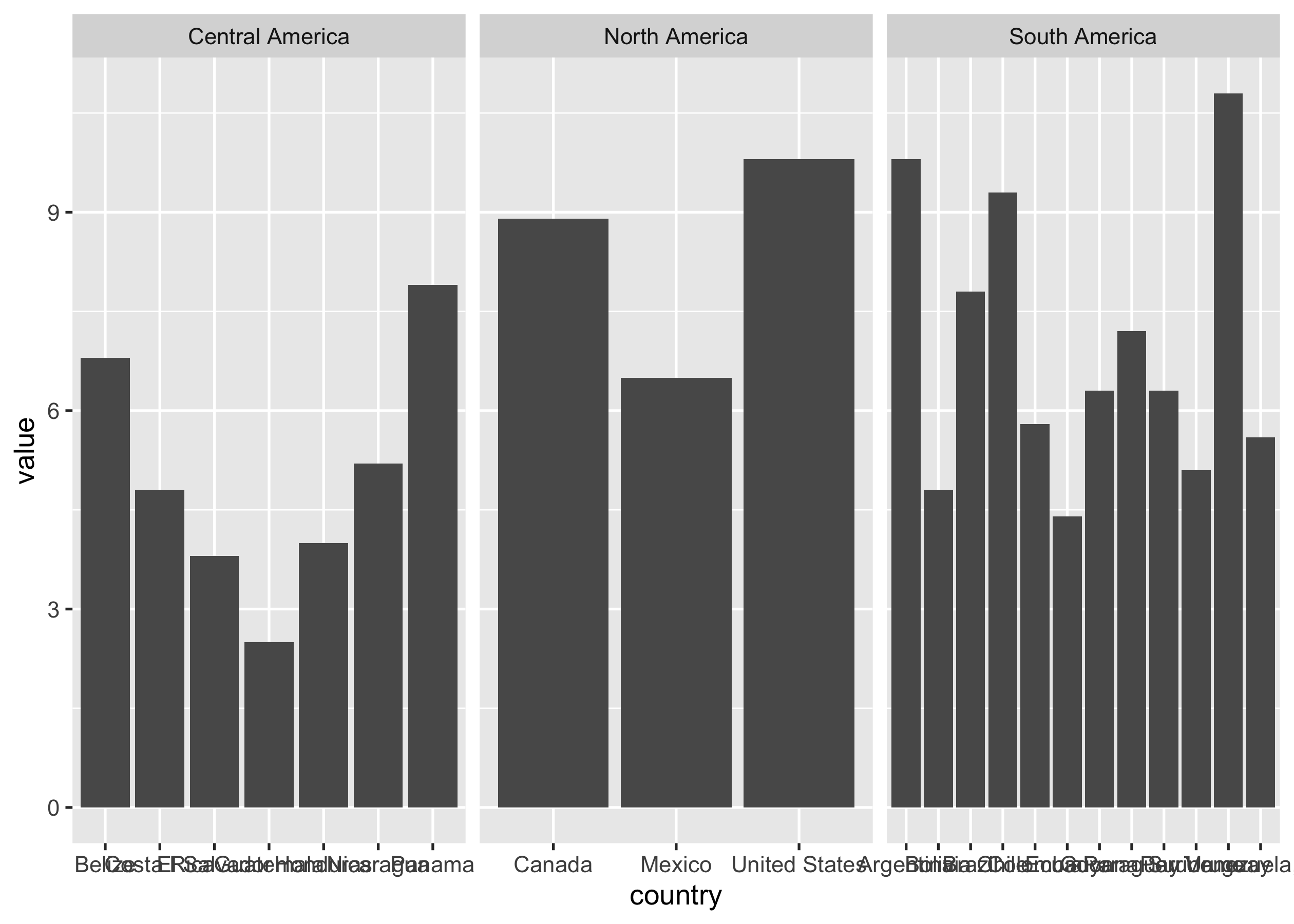
A few problems here: the order of the regions and countries are alphabetical; we can’t read the country axis labels; and the bars are different widths (the whole point of this post!).
To make all the bars the same width, I’m going to switch from facet_wrap() to facet_grid() so I can use the space argument to allow the widths of the facets to vary based on the number of x values in each facet.
alcohol_per_cap %>%
  ggplot(aes(x = country, y = value)) +
  geom_col() +
  facet_grid(cols = vars(region), scales = "free_x", space = "free_x")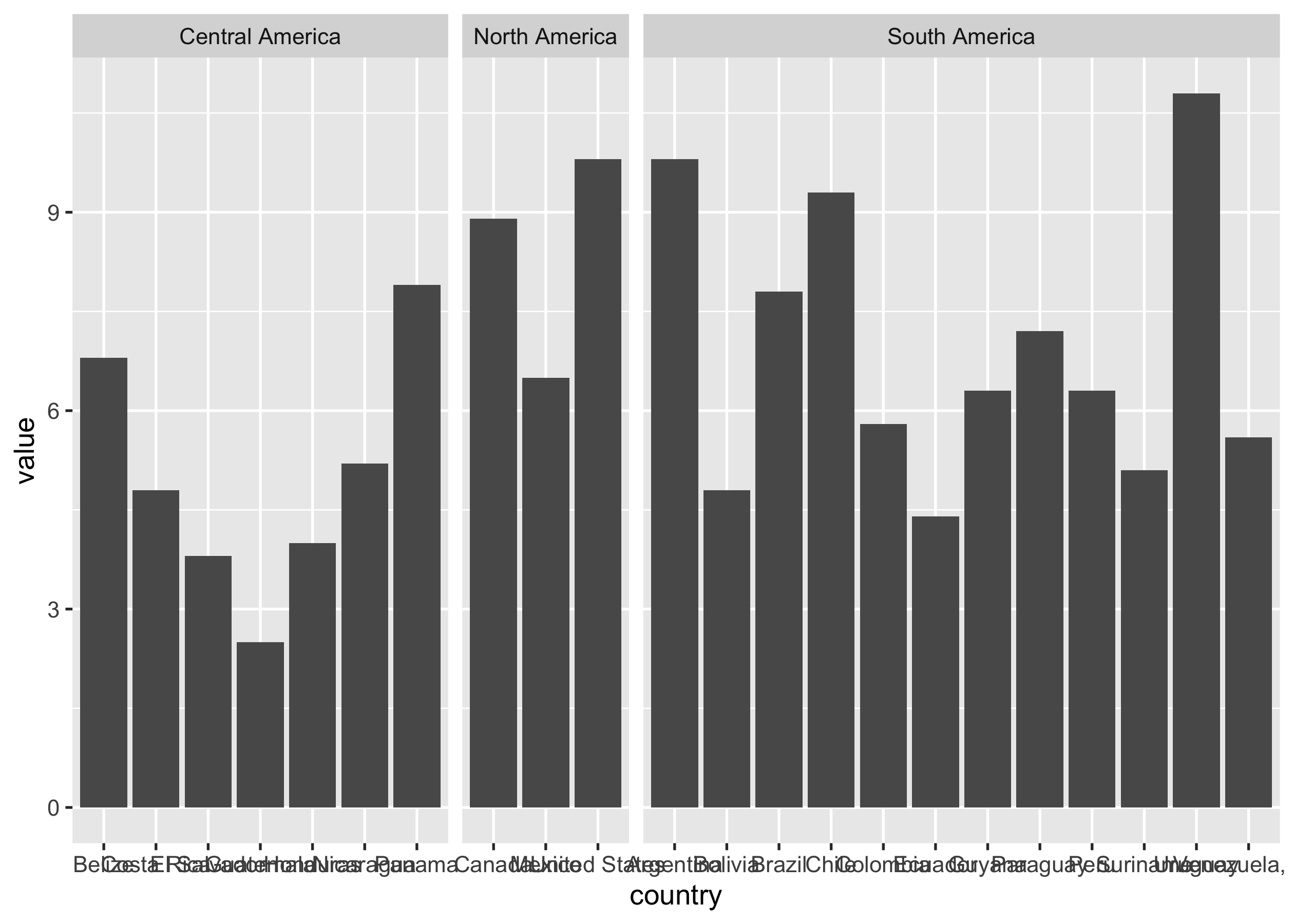
That’s better: the width of each region facet is now proportional to the number of countries in that region, making each country’s bar the same width.
Now, there are clearly many other issues with this plot, so I’ll polish it up a bit for fun.
alcohol_per_cap %>%
  mutate(
    region = fct_relevel(region, "North America", "Central America"),
    country = fct_reorder(country, value)
  ) %>%
  ggplot(aes(x = country, y = value, fill = region)) +
  geom_col(alpha = 0.8, width = 0.85) +
  scale_fill_brewer(palette = "Dark2") +
  scale_y_continuous(expand = c(0, 0.1)) +
  coord_flip() +
  facet_grid(rows = vars(region), scales = "free_y", switch = "y", space = "free_y") +
  labs(
    title = "Which country in the Americas parties (drinks) the hardest?",
    subtitle = "Total alcohol consumed per capita, 2016",
    caption = "Source: World Health Organization\nGlobal Health Observatory Data Repository",
    y = "Annual alcohol consumption per capita (liters)"
  ) +
  theme_minimal(base_family = "Roboto Condensed") +
  theme(
    plot.margin = margin(0.5, 0.5, 0.5, 0.5, unit = "cm"),
    plot.title = element_text(size = 15, face = "bold"),
    strip.text.y = element_text(angle = 270, face = "bold"),
    strip.placement = "outside",
    axis.title.x = element_text(margin = margin(t = 0.5, b = 0.5, unit = "cm")),
    axis.title.y = element_blank(),
    axis.text = element_text(size = 10),
    legend.position = "none",
    panel.grid.major.y = element_blank(),
    )
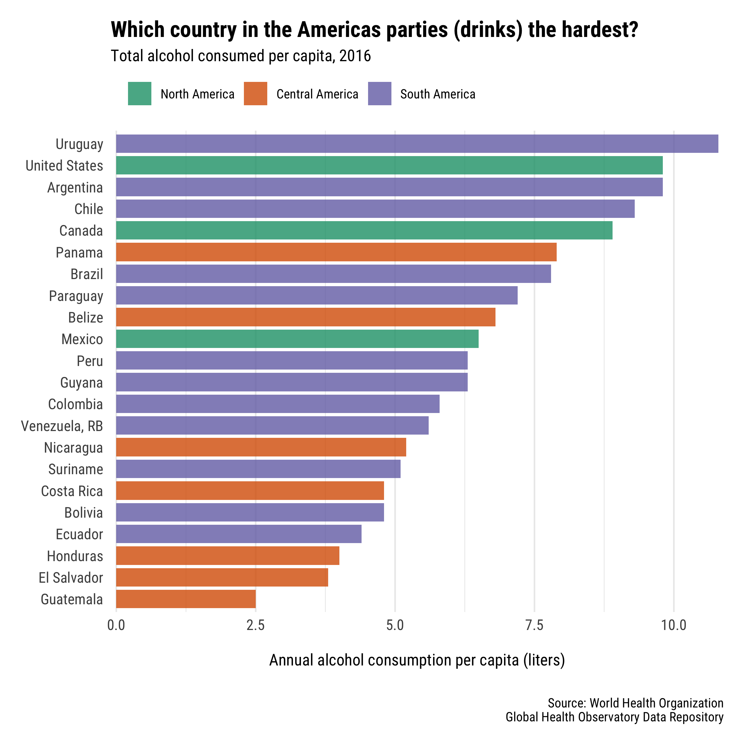
To be honest, I think this plot would actually be better without facets so you can more easily compare the overall ranking of countries. But, this was just a fun of how to use space = "free", right?
P.S. Spring Break 2020 in Montevideo?!?!


